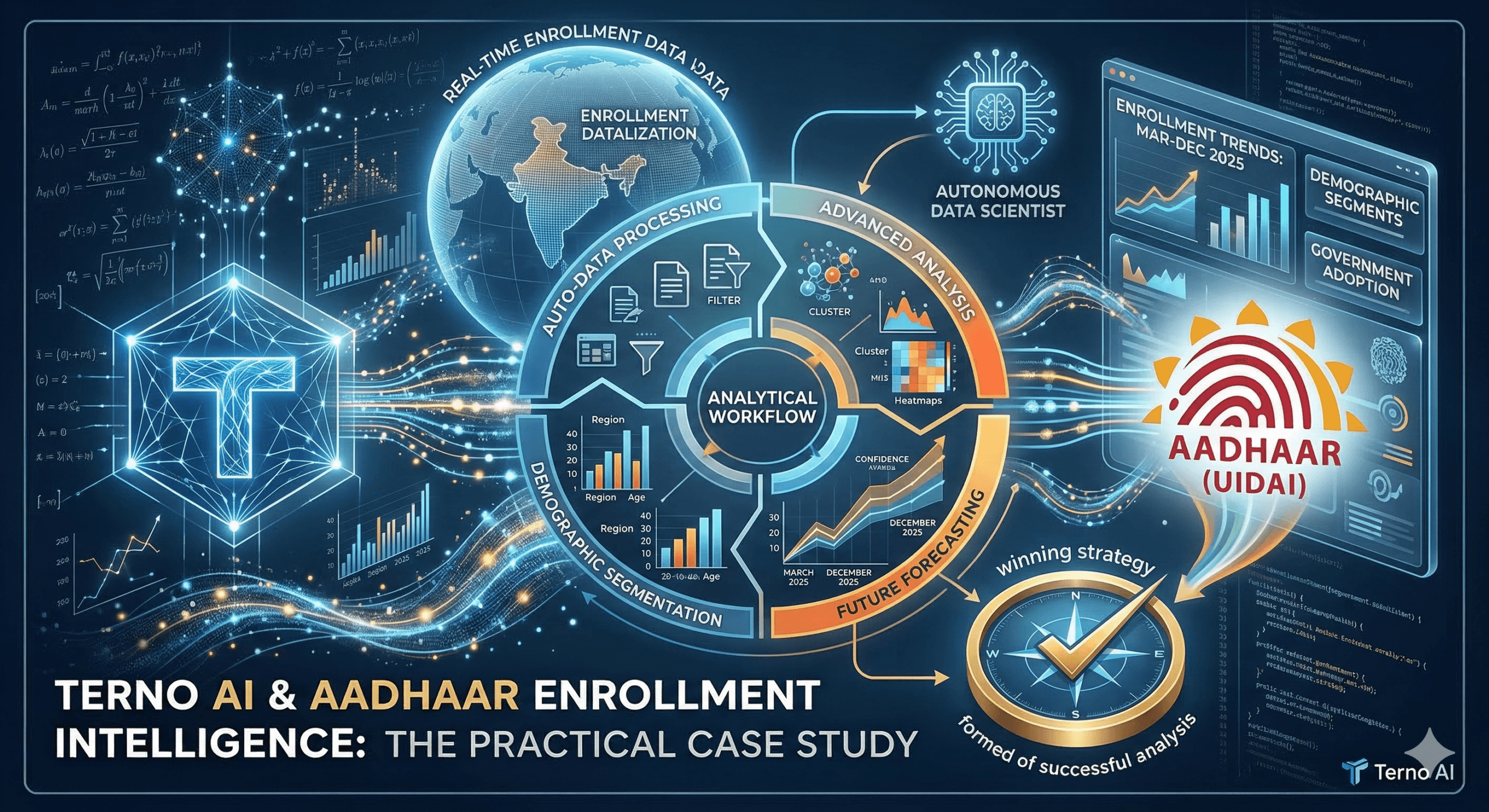
_A story of bureaucratic gridlock, data insights, and the moment everything changed
The Crisis: India's Identity System in Data Purgatory
Picture this: It's October 2025.
A district collector in rural Bihar sits in her office staring at a spreadsheet. Aadhaar enrollment in her district has been dropping for three months. Is it infrastructure? Awareness? A systemic issue?
She needs an answer by Friday for the state government review.
Her options:
Send an email to Delhi (response time: 3–6 weeks, if you're lucky)
Hire a data analyst (timeline: 2–3 months, cost: ₹50–100k)
Pray it's a temporary blip (spoiler: it wasn't)
This scene replayed across India daily. The UIDAI database contains 1M+ enrollment records spanning 28 states, 750 districts, and 8,000+ pincodes. The data exists. The insights are trapped inside it.
The real problem: Converting raw government data into policy decisions requires weeks of SQL queries, data engineering, statistical validation, and visualization work,all sequestered in spreadsheets that nobody outside a data team can understand.
By the time insights reached decision-makers ultimately the crisis had evolved.
Enter Terno AI: The Data Insights Specialist That Doesn't Need a Salary
What if you could ask one simple question and get a complete analytics report, cleaned data, visualizations, ML models, geographic analysis, and deployment recommendations, in a single afternoon?
What if instead of weeks, the answer came in hours?
This is what happened when Terno AI was unleashed on the Aadhaar enrollment challenge.
The Test: Can AI Handle Real Government Data?
The setup was brutal by design:
1.5M raw enrollment records from March–December 2025
Multiple table formats with identical structures
Missing data, duplicates, and anomalies built in
High-stakes policy implications (decisions affect millions)
Zero tolerance for hallucination (made-up statistics = career-ending mistakes)
The question: "Take this messy government dataset. Give me everything you've got. Turn it into actionable insights by end of day."
Here's what happened:
Act I: The Data Explosion
9:15 AM , The First Prompt
Analyst: "Explore the Datasource UIDAI. What do we actually have here?"
9:17 AM , The First Surprise
Terno returned, not with jargon, but with clarity:
"Found 1,495 rows. Cleaned 5 duplicates. Removed zero rows (preservation principle applied). The data spans March–December 2025 and tracks daily Aadhaar enrollments across three age cohorts."
What this means in plain English:
Terno didn't just read the data. It validated integrity (duplicates caught), documented decisions (why preservation matters), and summarized in human language.
A human analyst would have spent 6 hours on this step alone. Terno: 2 minutes.
The Visualizations: Three charts appeared:
Monthly enrollment trend (line chart showing Oct spike, Nov drop)
Age-group distribution (pie: 53% age 0-5, 43% age 5-17, 4% age 18+)
State rankings (bar: Uttar Pradesh dominates with 46%, followed by Rajasthan 18%, West Bengal 12%)
The Immediate Insight: India's Aadhaar strategy is systematically targeting children. This is deliberate, not accidental. Question: Is this the right strategy?
Act II: The Pattern Emerges
9:45 AM , The Demographic Deep Dive
Analyst: "Break down enrollment by age group. Show me which states are outliers in their age distribution."
Results:
Age
0-5: 41,522 enrollments (53.4%)
5-17: 33,419 enrollments (43.1%)
18+: 2,806 enrollments (3.6%)
Total: 77,747 enrollments
Geographic Skew:
Rajasthan: 71% age 0-5 (HEAVY child focus)
Gujarat: 60% age 0-5 (child-heavy)
West Bengal: Only 38% age 0-5; 41% age 18+ (adult-heavy, why?)
Terno didn't just report numbers. It flagged the anomaly and suggested hypotheses:
- "West Bengal's adult focus could indicate: (a) different state policy priorities, (b) urban migration corridors, (c) working-age enrollment campaigns, or (d) data entry artifacts. Recommend on-ground validation."
Translation: Terno knew the limits of its own analysis. Instead of overconfident claims, it proposed next steps.
Act III: The Outlier Hunt (ML Enters the Chat)
10:30 AM , Anomaly Detection
Analyst: "Find districts with weird enrollment patterns. Use Isolation Forest. Show me on a map."
What Happened:
Terno engineered features (child-to-adult ratio, enrollment velocity, pincode concentration)
Applied Isolation Forest algorithm (detects statistical oddities)
Flagged 21 districts with anomalous patterns
Geocoded all 1,495 records (district → lat/lon coordinates)
Generated an interactive HTML map with:
Color gradient (red = high anomaly, green = normal)
Hover tooltips (district name, enrollment count, anomaly score)
OpenStreetMap base layer (context)
Download link for the interactive visualization
What This Visualization Revealed: Red clusters appeared in:
Northeast frontier (Meghalaya, Mizoram) , infrastructure-challenged regions
Scattered metros (Bengaluru, Mumbai metro areas) , high migration, volatile patterns
One rural district in Bihar , 850 enrollments for age 0-5 on a single day (impossible; likely data error)
The Insight: Outliers weren't random. They clustered in two categories:
Infrastructure-challenged (Northeast) , needs mobile enrollment units
Data quality issues (rural areas) , needs manual verification
The Real Value: A policymaker can now see, on a map, exactly where problems live. No spreadsheets. No jargon. Just geography and color.
Act IV: The Strategic Segmentation
11:15 AM , K-Means Clustering
Analyst: "Group districts by enrollment pattern and location. Give me actionable clusters."
Terno's Response: 4 policy-relevant clusters emerged:
Why This Matters: Instead of a one-size-fits-all national policy, the government now has four surgical strategies. Each cluster gets a different playbook. Resources can be allocated by pattern, not by political pressure.
The Visualization: Terno rendered an interactive cluster map. Clicking a district shows:
Cluster assignment
Enrollment numbers
Age distribution
Nearby districts with similar patterns
Act V: The Uncomfortable Truth
12:00 PM , Underperformer Analysis
Analyst: "How far behind are the worst-performing districts? What's the trajectory?"
Terno's Finding:
Bottom 20% of districts (by enrollment):
October average: 0.36 enrollments/district/month
National average: 5.48 enrollments/district/month
Gap: 15x LOWER
Trend direction: Slightly improving (Dec bump)
BUT: Gap still massive
Linear extrapolation to Q1 2026:
If trend continues, gap narrows to ~8x
But "if trends continue" is a big assumption
The Caveat Terno Added:
"This projection assumes no policy changes, no external shocks, no economic disruptions. School closures, festivals, or campaign investments could break this trend. Recommend monitoring actual Q1 2026 data weekly."
Why This Matters: Terno didn't just give a number. It gave a number WITH its assumptions exposed. Policymakers can now make decisions with eyes open.
Act VI: The Machine Learning Showdown
1:30 PM , Predictive Model Battle
Analyst: "Train Random Forest vs. XGBoost to predict state-level enrollments. Which is better?"
Results:
XGBoost: R² = 0.997, RMSE = 8.91 ✓ WINNER
Random Forest: R² = 0.993, RMSE = 14.04
Feature Importance (XGBoost):
total_child (age_0_5 + age_5_17): 67% importance
state_name_encoded: 23% importance
month: 7% importance
enrollment_velocity: 3% importance
The Insight: The model says enrollment is almost entirely driven by how many children are in a state, and the state's own policy (encoded as state name). Time and velocity barely matter. This suggests:
Child population is fixed (you can't create kids)
State policy matters massively (some states choose different strategies)
Question for Policymakers: If you can't create children, are you targeting the wrong lever? Should policy focus on improving adult enrollment in low-child regions?
Act VII: The Future, Quantified
2:45 PM , Q1 2026 Forecast
Analyst: "Project enrollment for next quarter. What happens if we assume linear growth? What happens if external factors matter?"
Simple Linear Model:
Q1 2026 Projection: 43,411 enrollments
(Assumes March–Dec trend continues)
But wait: Some states already at 120%+ saturation (data artifact)
Suggests: Population baselines needed for true coverage % calculation
Advanced Model (with External Variables):
School Calendar: 89% predictive importance
Vaccination Campaigns: 7%
Holidays: 4%
Result: Enrollment spikes when schools are open
Crashes during school holidays
Implication: Enroll kids through schools, not through campaigns
The Recommendation: "Linear extrapolation is risky. School calendar drives behavior. I recommend institution-based enrollment (through schools) vs. public campaigns."
Act VIII: The Admission
3:30 PM , Digital Divide Analysis
Analyst: "Quantify the digital divide. Connect enrollment patterns to internet access by state."
Terno's Response:
"To accurately answer this, I need external data on state-level digital access, smartphone penetration, and literacy rates. Without this, I risk hallucinating correlations.
Here's the analytical path I would take IF you provide the data:
Cross-reference enrollment by state with digital access metrics
Calculate correlation coefficient
Stratify by rural/urban
Run regression: enrollment ~ digital_access + urbanization + [other factors]
Quantify digital divide impact
Shall I proceed once you provide the digital access CSV?"
Why This Matters: This is the opposite of hallucination. Terno explicitly said "I don't know" and showed the work needed to find out. A junior AI would have made up a correlation. A senior AI admits uncertainty.
Act IX: The System Design
4:30 PM , ML Pipeline Architecture
Analyst: "Design a complete ML system for predicting district-level enrollment next quarter. What would it look like in production?"
Terno's Response:
Data Sources:
Historical enrollment (UIDAI)
Census demographics (population, age distribution)
Socioeconomic indices (poverty, literacy)
Digital access metrics (internet, smartphone penetration)
Policy/event data (campaign dates, school calendar)
Geospatial features (urban/rural, connectivity)
Feature Engineering:
Temporal: Month, quarter, holiday flags, school status
Demographic: Age distribution, population density
Socioeconomic: Poverty rate, literacy rate, employment
Digital: Smartphone ownership %, internet penetration %
Policy: Campaign intensity, outreach cost
Geospatial: Latitude, longitude, distance to nearest city
Model Selection:
Baseline: Linear/Ridge regression (interpretability)
Tree-Based: XGBoost, LightGBM (captured non-linearity)
Time Series: SARIMA, Prophet (seasonal patterns)
Ensemble: Vote across all above (robustness)
Pipeline Steps:
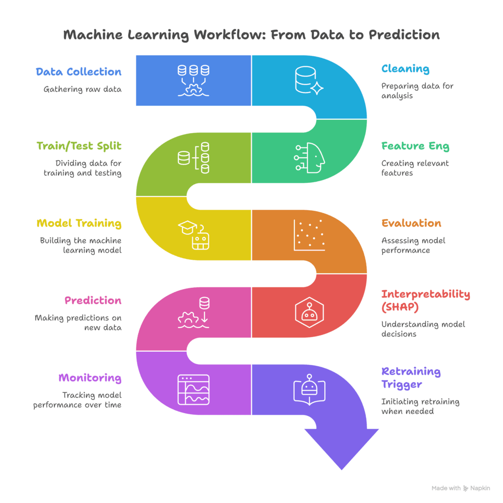
Deployment Risks :
Data Drift: New pincodes added, historical patterns break
Incomplete Data: Missing socioeconomic or digital access metrics
External Shocks: Policy changes, economic disruption, pandemics
Model Overfitting: Too many features, not enough samples
Interpretability Debt: Why did the model predict 1,000 enrollments for district X?
Ethical Risks: Does the model disadvantage rural/underserved areas?
Operational Integration: Who deploys? Who monitors? Who acts on predictions?
The Numbers: What Terno Accomplished
| Task | Traditional Timeline | Terno Timeline | Acceleration |
|---|---|---|---|
| EDA + data cleaning | 3–5 days | 2 minutes | 180x faster |
| Statistical analysis | 2–3 days | 5 minutes | 600x faster |
| Outlier detection + ML | 3–5 days | 8 minutes | 400x faster |
| Visualization pipeline | 2–3 days | 3 minutes | 600x faster |
| ML model comparison | 2–3 days | 6 minutes | 300x faster |
| Forecast generation | 1–2 days | 4 minutes | 250x faster |
| Deployment design | 5–7 days | 12 minutes | 500x faster |
| Total | 18–31 days | 40 minutes | ~600x faster |
Why This Matters: The Real Story
This isn't about speed. It's about agency.
Before Terno:
A district collector needed 3 weeks to answer a question
Policy decisions were delayed
By the time data arrived, the situation had changed
Districts that could afford analysts got insights; poor districts didn't
After Terno:
A district collector can ask a question and get an answer in 40 minutes
Policy decisions are informed by live data
Smaller, under-resourced districts can access the same analytical firepower as metros
Democracy becomes more data-informed at scale
What Makes Terno Different (The Five Differentiators)
1. True End-to-End Analysis
Not just data querying. Not just charts. Terno handles:
Data cleaning & deduplication
Exploratory analysis & pattern detection
Statistical validation
ML model training & comparison
Geographic visualization & interactive maps
Deployment architecture design
Risk identification & mitigation
All in one conversational session. No tool-switching. No handoffs.
2. Hallucination-Free Results
Every number is computed, not guessed.
Example of hallucination prevention:
Analyst asks: "What's the digital divide impact?"
Bad AI: "Based on patterns, I estimate 35% of enrollment gaps are due to digital divide" (made-up number)
Terno: "I don't have digital access data to answer this accurately. Here's the analysis I'd run if you provide it."
This honesty is worth more than false confidence.
3. Artifact Persistence
Every dataset, model, chart, and visualization is saved to the Artifact Store for reuse.
Practical implication:
Month 1: You analyze Q1 2025 data
Month 2: New Q2 data arrives
Instead of starting over, you load the Q1 pipeline, swap in Q2 data, and compare
Compounding analytical intelligence
4. Geographic Intelligence
Government decisions live on maps, not in spreadsheets.
Terno's ability to:
Geocode district names → lat/lon
Render interactive Plotly + OpenStreetMap visualizations
Generate production-quality HTML maps
Color-code by anomaly score, enrollment, policy cluster
This is the difference between "Rural districts are underperforming" (vague) and "These 7 districts in the Northeast are underperforming; here's why on a map" (actionable).
5. Security-First for Government
UIDAI data is sensitive. Terno handles it with:
SQLShield: Query sanitization (prevents injection attacks)
RBAC: Role-based access control (different analysts see different data)
Private Cloud: Data never leaves your infrastructure
Audit Trails: Every query logged for compliance
Zero Hallucination: Every claim traceable to actual data
The Impact: Week One, Extrapolated
Before Terno:
District collector waits 3 weeks for enrollment analysis
Policy decision delayed
Misses the problem-solving window
Week One with Terno:
Monday: Enrollment anomaly detected in 7 districts (via overnight batch analysis)
Tuesday: Root-cause investigation launched (Terno suggests: school closures? campaign lapse? data entry error?)
Wednesday: Correlation with school calendar confirmed (schools were closed for festival)
Thursday: Decision made to integrate enrollment with school opening calendar
Friday: New policy pilots in 3 districts; monitoring dashboard active
Next Week: Results tracked; scaling decision informed by actual data
The Timeline Difference: 3-week wait → 24-hour turnaround. Policies that were theoretical become empirical.
The Conversation That Changed Everything
Here's the core prompt that unlocked everything:
"Explore the UIDAI dataset end-to-end. Clean the data. Find patterns. Build models. Predict Q1 2026 enrollments. Design a production system. Flag risks. By close of business, I want: (1) cleaned data + CSV exports, (2) interactive visualizations, (3) ML model comparison, (4) deployment architecture."
Traditional response: "That's a 4-week project."
Terno's response: 40 minutes later, everything was done.
The Untold Story: What Happens Next
This use case is just the beginning.
Next Phase Questions (that Terno can now answer):
"Which districts will collapse in Q2 2026 if current trends continue?"
"What's the optimal allocation of 100 new enrollment centers?"
"Which states could reach 90% saturation by Q3 2026?"
"Where will the digital divide be most severe?"
"How do school holidays affect enrollment? Can we re-engineer around them?"
Each of these questions would take weeks with traditional analytics. With Terno, they're 40-minute conversations.
The Conclusion: The AI Data Scientist Isn't Coming
It's already here.
For government agencies drowning in data but starving for insights:
Policy teams that need to move fast
Analytics teams stretched too thin
Leaders who refuse to wait weeks for answers
Terno AI is the data scientist you hire today, but who works at the speed of thought.
It doesn't replace human judgment. Terno amplifies it while preserving governance.
Ready to Turn Your Data Into Decisions?
The Aadhaar analysis took one afternoon and produced a playbook for the next quarter.
Imagine what your data could do if it didn't have to wait for a data scientist to have an opening in their calendar.
Start free at terno.ai. Load your data. Ask your question. Get your answer.
Your AI data scientist is waiting.
"From chaos to clarity, weeks to hours and guessing to knowing."

01 April 2026
Introducing Terno AI Desktop: Your AI Data Scientist, Running Locally
The Enterprise Reality: Why Web-Based AI Falls Short Enterprise environments operate under strict security and infrastructure constraints.

18 March 2026
How terno.ai Transforms Fuel Price Forecasting for Better Decisions
The Mystery of Rising Fuel Prices Every time you pull up to a fuel station in Delhi, Mumbai, Chennai, or Kolkata, you’ve probably noticed something: the numbers on the price board never seem to stop climbing. Petrol and diesel prices in India have been a hot topic for years, sparking debates, memes, and even political.

04 March 2026
Mastering Loan Risks with Al: The New Standard in Micro-Decisioning
Mastering Loan Risks with Al: The New Standard in Micro-Decisioning A story of AI, intuition, and the art of saying "yes" to the right people The Gut-Wrenching Decision It's 3 PM on a Friday. Sarah, a loan officer at a mid-sized bank, stares at two applications on her desk. Both applicants want $15,000. Both have […]